Fantastic news! Our Getting More Out of Widgets! post inspired community members to make adjustments or add extra widgets to their blog, plus motivated some to do “blog makeovers”.
Larry Ferlazzo suggested
Here in the U.S there’s a popular TV show where producers go into someone’s home, and completely redo a room. Crazy idea, I know, but it might be fun for you to offer to do that to a blog and as a teaching tool for the rest of us.
What an excellent idea Larry and here’s the best news!
As you asked for assistance, we choose your blog for the makeover and will be writing a series of posts on Larry Ferlazzo’s Website of the Day “Blog Makeover” to share blog design tips and additional info for customizing widgets.
But before we begin– Gail Desler, from Blogwalker blog, has shared with us her excellent Introductory manual for using Edublogs which is definitely worth bookmarking for future reference! Make time to go past Gail’s blog and write a comment to thank her for sharing!
Importance of Your Blog’s Presentation Theme
Your blog has two distinct groups of readers:
- Those that subscribe to your blog via RSS feed or email;
- and first time readers who view your blog via it’s web address.
It’s these first time readers we want to engage and get to subscribe to our blog. Unfortunate fact of life, we do judge a book by it’s cover! People are more likely to both read your posts and subscribe to your blog if it’s pleasing to their eyes.
Refer to page 12 & 13 of Gail’s Introductory Manual to Edublogs.
Larry’s Original Theme
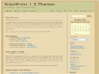 For those unfamiliar with Larry Ferlazzo’s Website of the Day — Larry’s well known and very popular for sharing great information on websites for teaching ELL, ESL and EFL. His original theme was Batavia 1.5.
Nice simple theme but the beige background behind the text in his posts detracted from the great content he was sharing. Made worse by his long blog name that cluttered his blog header.
Larry’s Next Theme
Larry had already decided that there was better themes for his blog and was trailing them before we offered our assistance.
But there was two main problems with the new Copyblogger theme:
- His long blog name was totally overwhelming the blog header. Solution was to shorten his blog name and use a theme that included a tagline!
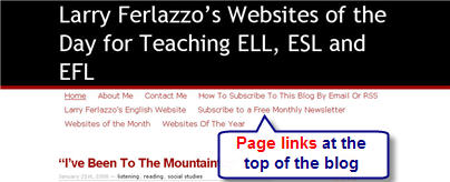
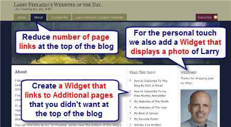
- Too many page links displayed along the top of his blog was making it cluttered and messy. Answer lies with Pages, Sub-pages and a widget.
Why Blogs have Taglines
The concept behind a blog tagline is to create a memorable phrase that sums up the tone and premise of a blog. Ideally all blogs should have a tagline since they instantly tell first time readers what your blogs all about and whether you write posts in topic areas that interest them.
Unfortunately not all blog themes include a tagline however a work around, if you’re good with Photoshop, is to use a theme with a customisable header and add the tagline to the image in the header e.g. check out the header on my personal blog and Graham Wegner’s Teaching Generation Z blog.
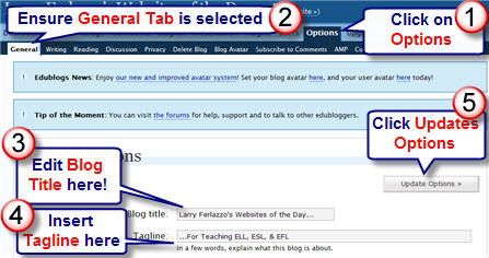
With Larry we changed his blog name from Larry Ferlazzo’s Websites of the Day for Teaching ELL, ESL & EFL to Larry Ferlazzo’s Websites of the Day… and added the tagline … .For Teaching ELL, ESL & EFL.
Larry’s New Theme 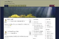
He also decided to change from the theme Copyblogger but couldn’t choose between Glorious Day or Glossy Blue.
The trouble with themes is each has their advantages and disadvantages. Both the new themes included taglines but the background colour behind the text and the text styles was easier to read with Glorious Day.
Why Blogs Have Pages
Edublogs, because it uses WordPress, has the definite advantages of being able to customize and reduce blog clutter considerably more than Blogger blogs. Clutter distracts readers making them less inclined to subscribe to your blog. One of the best ways to reduce clutter is to use pages.
Pages, are similar to posts, except they can do more than a post. You normally use pages when you want to present information about yourself or your blog that you always want readers to be easily able to access. Examples of pages on this blog are: About and Want Automatic Notification. For more information, read the differences between pages and posts.
Pages can also be organised into Sub-pages within your pages, creating a hierarchy of pages. For blog themes that display pages along the top, this is a great way of controlling what pages are displayed as only those with no parent are displayed. The Want Automatic Notification is located on a sub-page below the About page.
Larry’s New Look
Below is what Larry’s blog now looks like after creating pages, sub-pages and using a widget to link to the sub-pages.
Our next post will show how to create widget that link to sub-pages, a widget for photos and provide tips for decluttering your side bar.
General Tips for doing a blog makeover
Here are some tips for doing a blog makeover that will make your site look and feel new again
1. Identify your goals: Before you start making any changes, take some time to think about what you want to achieve with your blog makeover. Are you looking to increase traffic, engage readers, or improve your branding? Knowing your goals will help you make informed decisions about what changes to make.
2. Choose a new theme or template: The design of your blog is one of the first things that readers notice, so it’s important to choose a theme or template that reflects your style and brand. Look for a design that’s easy to navigate and visually appealing.
3. Update your logo and branding: If your blog has been around for a while, it might be time to update your logo and branding. Make sure that your logo is clear and easy to read, and that your branding is consistent across all your social media accounts.
4. Clean up your sidebar: Your sidebar is a valuable space for showcasing your content and promoting your brand. Remove any clutter and make sure that your most important widgets are easy to find.
5. Improve your navigation: Make it easy for readers to find the content they’re looking for by improving your navigation. Add drop-down menus or a search bar to help readers quickly find the information they need.
6. Update your content: A blog makeover is a great opportunity to update your content and make sure that it’s fresh and relevant. Remove any outdated posts and make sure that your most popular content is easy to find.
7. Optimize for mobile: More and more people are accessing the internet on their mobile devices, so it’s important to make sure that your blog is optimized for mobile. Choose a responsive theme or template that will look great on any device.
A blog makeover can be a lot of work, but the results are worth it. By following these tips, you can create a blog that looks and feels new again, and that attracts new readers and engages your existing audience.
FINAL THOUGHT
We’d love feedback on Larry’s blog makeover, please check it out and provide your thoughts on further improvements. And if you’re in the process of a blog makeover let us know so we take a look!
Other posts in our “blog makeover” series include:
- How To Add Your Photo to Your Blog Side Bar
- Creating Hyperlinks Using HTML
- What To Consider When Choosing Your Blog Theme
If you are enjoying reading this blog, please consider ![]() Subscribing For Free!
Subscribing For Free!


Wow, an article headlined “getting more out of your widget,” could compete with “getting more out of your gas dollar(s). This is all new for me, but I’m finding it all fascinating…
hey guys i love the edublogger u guys have some sweet tips
SMK 4 Makassar, adalah sekolah menengah kejuruan yang berlkasi di Makassar
nothing much is happening with my life is boring as always…wow
Im a bit of a noob at this tho
In my few days of blogging, I had visited Larry’s blog and the new format is certainly more professional looking. Well done Sue and Larry. Making me think now about my new theme….
Hi Alice – Glad you liked Larry’s makeover and interesting question regarding header images vs. text. But first I have to ask how are the cookies you mentioned you might have to bake for Larry coming along?
I’ve had a quick look at a few of the professional blogging sites to see their preference for text vs. image. Definitely the text of the site name dominates their header and if an image is present it tends to one side. Doesn’t appear to be influenced by use of images in posts. Trouble is, as you know, we have limited options to customise. I personally like using one with a customisable header so I can at least adjust this aspect.
In terms of images in post, I’m definitely a visual person and think good use of images helps break up posts.
Sue, you did a fantastic job with Larry’s site. Can we discuss the choice of header images vs. text? I think the header images and adding Larry’s photo are great because his posts are text-only. This gives a nice visual to soothe the eye. OTOH, at In Practice I’m thinking of having pics in the posts more often and on my blog I already do have a lot of images going up, so I went for a no header image theme. This keeps all the images from competing with each other. Another option is to make a fancy text based top image like this one (I know Fjords is a weird layout for a theme, but I had reasons for picking it). I used cooltext for that header. My takeaway: If you are doing a visual blog, skip a photo image on top.
Hi Joel – thanks for telling us about your blog makeover. Your blog definitely looks user friendly now.
Great stuff here! I totally overhauled my blog at the beginning of the year and tried to make it as user-friendly as possible.
I added Gravatars to comments and posts (guest posts display the guest author’s avatar).
I completely changed the color scheme.
I justified and spaced out the text to make it easier to read.
I switched the headlines to small caps.
I redesigned the logo to match the new color scheme.
I separated comments from trackbacks.
This post is a great example of how it all fits together!
I’ve just been looking at some of the blogs mentioned here – so many good ideas! Hope you don’t mind some poaching.
One thing I’ve only just discovered that has made my pages both look better and be easier to create is the “Add gallery” button. I’ve been inserting photos into pages one at a time, trying to place them, trying to get them the right size… wish I’d discovered that button a year ago!
Thanks to all for the great tips.
Catherine
Hi tc65 (I think Mrs C) – glad you liked the posts on Larry’s blog makeover. Your blog for your class is looking really good.
I am always looking for ways to make my blog better so was interested in Larry’s ideas. Thanks
Thanks Kate – hope it helps your teachers with learning Edublogs. Please encourage them to ask questions because it helps me work out what information I need to write in posts. Definitely agree with themes – takes me ages to make up my mind.
Hi Kevin (Dogtrax) – agreed Larry does an excellent job with his blog, and was grateful for the opportunity to assist him as he shares so much with others. Gail’s handout is fantastic. Good point about the RSS and I will definitely mention this is the next post.
Larry – I was just pleased that you let us help with the makeover. But you should give yourself credit for some of the decisions as you did provide suggestions of which themes you preferred and I just helped you then make it work better.
Sue – Thanks for your feedback on Larry’s blog makeover. I regularly go past your blog and really love your theme. Well suited to your blog. Very clean, professional and grabs attention. I think you’re doing really well.
In my few days of blogging, I had visited Larry’s blog and the new format is certainly more professional looking. Well done Sue and Larry. Making me think now about my theme…….
I feel like I was the recipient of a wonderful gift from Sue! I appreciate Kevin saying that I did a great job approaching my blog from the aesthetic point of view. However, my aesthetic taste, as my wife would affirm strongly, is non-existent.
I have to admit my role in the redesign primarily consisted in getting a series of emails with suggestions from Sue asking me if she should make this or that change in the design, and my quickly responding “yes” each time.
Larry did a great job of approaching his blog from the aesthetic point of view and your tutorial here is helpful. Also, I have used Gail’s handout in workshops before (she knows this and I deeply appreciate her work on our behalf).
All these concepts draw me in yet again to the sense of community that can be developed here in the edublogging world.
Thanks
Kevin
PS — I guess we should note, though, that if you do make over your blog and most of your readers are via RSS, they may not even be aware of the change. In my Bloglines, everything looked the same, so it is helpful to let readers know and invite them in to the site.
And as readers, it is nice to sometimes leave the confines of RSS and venture out into the blogs themselves.
Just a thought or two …
This post does a great job of explaining how to choose a good theme. I’ll be letting all of my colleagues (I’m doing some training with them on blogging using edublogs!) know about The Edublogger and may just tell them to Ask Sue for many of their questions 🙂 I struggled quite a bit with choosing a theme for my personal blog (and thanks for all the help, Sue) and finally found one I’m happy with. The one Larry chose is the one I have on my classroom blog and a blog I’m doing as a collaborative project with some other teachers.