One of the most difficult parts of negotiating blogging is images.
I hate images.
Really, really, really hate images. To me, a picture is a picture is a picture.
Over the last few years, however, I’ve learned that image sizes are one of the most important parts of a blog layout when trying to ensure consistency across devices and platforms.
This means I’ve had to expand my technological capabilities and my vocabulary.
Collage makers are great. Once the collage is completed, however, getting it to look right and be visually pleasing on both desktop and mobile can pose a challenge.
In this post, I’ll walk you through some of the steps to adjusting pictures online using PicMonkey, although Pixlr also works similarly.
Both of these are free web applications that allow you to change and enhance photos so that your website is the best looking version you can make.
Key Terms
Before beginning the tutorial, a few key terms need to be defined.
Crop
This means to take certain areas of a picture and focus them.
For example, if a picture has a chair on the left and a bunch of nothing on the right, and you just want the chair’s image, you crop the image to focus only on that. Keep in mind, this can change the pixel count.
Cropping can also mean changing the proportions of an image so that a landscape image is changed to a portrait image. In other words, a long wide picture and be redefined as a tall skinny picture. This will change the focus of the image, so we need to keep that in mind.

Exposure
Back in the old days, exposure used to mean how much time the shutter was open impacting the amount of light through the lens.
Today, when editing photos, it more generally means playing with the brightness, highlights, contrast, and shadows in a picture.
For example, sometimes you take a picture in a dark room and the figures are difficult to see. With photo editing, you can adjust the brightness so that the figures are clearer. If the image is so bright that you can’t make out the shapes, you can do the reverse.

Pixel
These are small dot like pieces of information that aggregate into a larger image. An easy way to think about them is to imagine coloring in a picture on graph paper. Each box gets one color. You color in groups of boxes to make up the picture.
The smaller the boxes, the more defined the picture is. Pixels in images work the same way. The more pixels there are, the clearer the image is and the more it looks like the original image.

Resize
This seems a lot like cropping, but what you’re doing is changing the number of pixels to making the image larger or smaller. Assume you find a picture that looks great but needs to be wider, using resize you can do this.
However, you need to keep in mind that when you resize an image it changes the pixel sizes and can make an otherwise crisp picture a bit blurry.
Rotate
This basically means moving the image around. Sometimes it means flipping it to the mirror image; other times it means moving it in a clockwise/counterclockwise direction.
Important tip:
- Some software such as Facebook assumes that all photos are taken sideways, in landscape mode, so that when the image is uploaded it may be sideways or upside down.
- Simpliest solution is to hold the device in landscape mode with the home button on the right when taking photos on smartphones and tablets so you don’t have issues with them rotating when uploaded to websites.
Sharpen
Sharpen is great when you’re trying to blend an image into a background. You can play with colors then blur them or sharpen them to make the images fit together visually.
While you can do a lot of other things in photo editors, this is all you really need to know for a beginning tutorial.

Introduction to PicMonkey
Once you have the picture you want, you go to your choice of website to help.
My two favorites are Pixlr and PicMonkey. Mostly I like them because they’re free, but they’re also extremely user friendly.
This tutorial will use PicMonkey because it plays better with my computer although they both have the same free features. PicMonkey also has a slightly easier and more aesthetically pleasing interface making it great for beginners.
So, you have your photo and it looks like this:

The bad lighting and shadows mean that none of the items are clear. I planned to use this photo as a featured image for a giveaway I was running.
This meant that the objects needed to be clear and enticing.
The first thing I did was go to PicMonkey, and click “Edit a Photo.”

This brings you to the homepage that allows you to do your magic. At the top is the “Open” drop down menu.
Clicking on that led me to options such as computer, my hub, templates, and Facebook. The benefit that Pixlr has over PicMonkey is that Pixlr will allow you to edit a picture from a URL.
This option is great for making memes or bringing in images from current events for your students.

Once you click on “Computer,” you’ll be taken to the place where you store all your files whether it’s a hard drive or cloud drive.
Click on “Choose.”
Now your screen should look like this:

Once you click “Choose,” you’ll see this:

The most common feature in photo editing is cropping.
If you crop a photo, you’re focusing on part of it that matter most. For example,
I don’t really need my entire dining room in this picture. I might want to crop the image.
Go into the “Crop” area. You’ll see this:

You can drag those little circles all over the place to focus on the parts of the image you want taken off or “cropped.”


If your picture is dark, like mine was, go to “Exposure” on the left, and move the brightness around.
The further to the right you move the brightness, the lighter the picture gets, further to the left, the darker.

If you want to play with the colors, you can work with the “Colors” tab. Increasing the saturation makes the colors more vivid, decreasing makes them more monotone.

Increasing the temperature increases highlights the warm colors, decreasing highlights the cool colors.


For many blogs, however, the most important button here is Resize.
While sometimes cropping an image can accomplish this task, often times it can’t.
Many blogs require certain pixel sizes to show up on mobile devices or to look good for social media. This means that you need to find a way to match those requirements. The original version of this photo is 3128 x 2346 pixels. That is gigantic. It also takes up a lot of memory on your site and may not be able to upload. This is where you can change that. A lot of website prefer 750 to 1000 pixels in width and 500-750 in height.
If you click the “keep proportions” button, you keep the photo exactly the same only better for uploading.
Like this:


Resize is excellent also for those images that need to be made larger. So you find this great picture online, but the picture is 640 x 426. That picture won’t show up well on your blog because you need it to be 750 at minimum.
You go into resize.


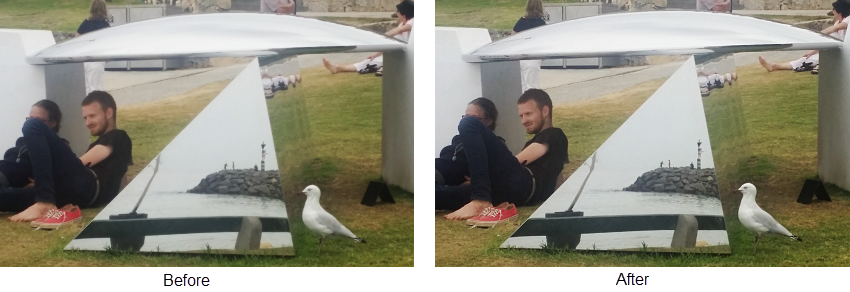
Sometimes, the resizing makes the picture look a little fuzzy.
In the above image, the difference is subtle. If you focus on the front left lily pad, you can see that it’s a bit fuzzier after being resized, same with the reflection.
This is when you want to click on the “Sharpen” tab and use the “sharpness” function not the clarity function. Clarity only increases midtone contrast.
On small pictures this is fine, but if you need to enlarge them later on to fit in a blog post, they’ll look weird.
So, if you want colors that aren’t specifically cool or specifically warm to look better, then you’re going to want to increase sharpness. If you want to increase the sharpness before the sizing, you can do that.
You might even want to play around with the sizing and sharpness functions to see which works better before or after. You can do this easily with PicMonkey because it has an “Undo” button under the picture.
If you at the sharpened images below, you can see the difference between the image above and this one. the edges of the flower are crisper and even the unfocused background looks more

Despite my curmudgeonly approach to images in posts, they can make a post pop or look more professional.
Understanding your blog’s requirements will allow you to work with your restrictions so that the perfect picture can be made to fit them instead of left out of your post.
Your Tips!
Let us know in a comment your tips for editing or creating images for posts.

PICMONKEY is one of the best image editing applications now-a-days. It has many effective tools and techniques by which we can do many types of editings. The tips you shared are really amazing and useful. Thanks a lot for the share.
This site is such a good idea. You can edit and touch up photos, add amazing effects, select from a huge selection of fonts, and more. It is really easy to use and it does not require previous experience or too much time. Thanks for sharing!
this picture is cute
I would like to try the free PicMonkey, but can only find the PicMonkey that offers a free trial with my credit card number. Is there really a free PicMonkey and if so how do I find it?
I use pick monkey too
I like pictures. They can be funny and descriptive. There would be no movies if it wasn’t for pictures.
Is your name from a card game? Just wondering