Can you use too many graphs in blog posts? Like any ideas for using images in blog posts you do need to use a mixture to keep it interesting for readers.
However I’m sure you would want to know about more online graph creators, especially one that can be used to as an equation editor. Thanks to Donna B. I’ve now learnt how to use GraphJam. Like Crappy Graphs, it’s extremely easy to use, but has different features and you can create graphs with white backgrounds.
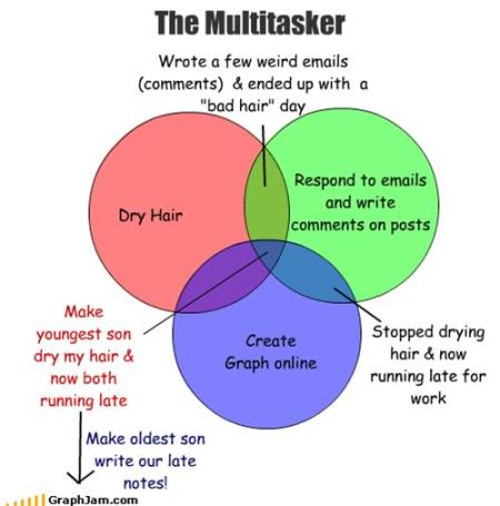
Here’s a quick Venn diagram to highlight the potential dangers on me multitasking:
Best news is GraphJam also provides an option for writing formulas which I’m sure will be useful for all educators and their students.
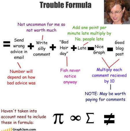
Here’s my trouble formula for estimating the degree of trouble multitasking could cause. Would love those who are good at maths to check it and let me know if I’ve missed part(s) of the formula! And look you can add pictures to your equations!
Meanwhile I now have more graph envy after seeing Jessica Hagy use of them in blog posts thanks to Gail Poulin’s recommendation.
FINAL THOUGHTS
Thanks to Steve Dembo and Donna B., I may have a graph addiction but at least I’m in good company (looks like Larry Ferlazzo and Jolene Anzalone have joined me).
Based on my formula, and given the fact Donna B. also told me about the WebTools4U2Use wiki, it looks like the only way to keep me out of trouble is for you to leave comments! Please HELP me out of this TROUBLE.
All comments welcome but would especially love suggestions for blog posts. E.g. What would you like me to write about? What would you like to learn more about? What questions would you like me to ask readers?
If you are enjoying reading this blog, please consider ![]() Subscribing For Free!
Subscribing For Free!


HI SUE WATERS
Could you give a clue of an online graph maker whichh his apple to give me the equation of the graph?
Thank YOU,
HELLO KITTY <3
Thanks Carjbru – I’ve checked out that graph creator and tried it. Really good option for using with students.
HI Sue
This is the graph creator I use for my little ones (Gd 2 and upwards) – it works really well:
http://nces.ed.gov/nceskids/createAGraph/
@Fran Hopefully those instructions I sent via email have helped. The reason why I haven’t explained in a blog post is because I keep hoping that the issue with images will be fixed (on how WordPress uploads them that is).
@Ken Now you see scientist love graphs. They are a way of presenting the most important facts in a simple form. Definitely in these situations I did use too much text but I just couldn’t help myself. Had wanted to add hubby displeasure into my formula but ran out of room.
Kia ora Sue
I don’t know! You scientists! 😉
I always think graphs make things complicated anyway. Still, they can be colourful and give the reader something to look at. But interpreting them? Not many people can do that.
I think it’s a bit like reading-ease. You can go over the top with all the highfalutin graphic data. If it’s complex, colourful and pretty enough it doesn’t really matter, for most people would rather appreciate the aesthetics of the diagram than try to interpret it.
But post a whole load of boring graphs with scales and keys and things and you might as well use dense text with 6 point font and no full stops or paragraph breaks.
Anyway, I like your Venn diagram.
But your trouble formula! Especially the one wid da squiggles. Einstein!
Catchya later 🙂
from Middle-earth
You asked what else you could write about – and maybe you already have – but I am having a LOT of trouble inserting graphics. Maybe I got spoiled by how easy it is to do with Word, but most of the time, I just plain can’t get the pictures included in my blog posts, so I give up and do without. The directions seem to assume I know what I’m doing, and I sure don’t.