In the coming months, we’re retiring a large number of older themes from Edublogs and CampusPress networks.
Reasons why we’re retiring these themes include:
- Many of these themes have been around for 8-10 years, and are outdated.
- Google is now penalizing sites that aren’t mobile friendly.
- Over 20% of traffic to blogs we host comes from mobile devices! That number keeps growing each year.
Going forward this means we’ll only be supporting mobile friendly themes.
This is an important change for those that are used to older themes because mobile friendly themes work and behave a little differently than older themes.
Here’s what you need to know about mobile friendly themes and why they are better for your readers.
About Mobile Ready Themes
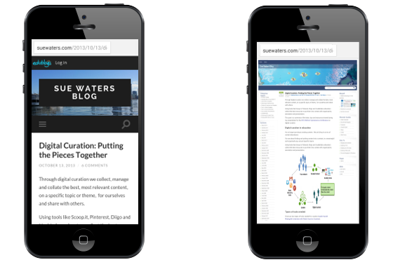
Mobile-ready themes, also known as responsive themes, are designed to optimize the layout of your site based on which device some one is using to view your blog. If you view a non-responsive theme on a phone it automatically zooms out so that your entire blog can be seen. This means your readers need to zoom in to read your content.
Responsive themes are designed to ensure that the important content like your blog title, post titles and post content can be easily ready on smaller screens without needing to zoom.
Here is an example of what a responsive theme looks like on a desktop computer, tablet and smartphone.

How Mobile Ready Themes Work
Responsive themes feel like a huge change when you’re used to non-responsive themes because responsive theme layout changes as the device size changes.
With a responsive theme, the sidebars move below the post content area and the top navigation changes or minimizes to improve reading on smaller screen.
Layout doesn’t change on a non-responsive theme as these older themes that are designed to be viewed on desktop computers aren’t optimized for smaller devices.

While it might feel like a big change for you, it isn’t for your readers. Most websites now use responsive theme designs or a mobile solution that changes the look of the website when viewed on a mobile device.
Theme Retirement Process and Timeline
Beginning today, we will display a notification in the dashboard of any blog using one of the older themes which asks users to change to a newer theme. At this time, the theme will also disappear from the available theme list.
On July 7, any site still using the retired theme will be automatically switched to the default theme. No content will be lost during the theme change, but if there is a different number or arrangement of sidebars, you may need to set up some widgets again.
What’s Next?
We’ve just uploaded 50+ new mobile friendly themes, bringing the total to well over 200! Check them all out under the Appearance > Themes in your blog’s dashboard.
More on how to change your blog’s theme is found here.
Let us know in the comments below if there is anything you’d like to see or if you need help changing to a new theme! We’re always happy to provide assistance.

Is it possible to disable mobile themes in Edublogs?
Hi Claudia. Since the theme retirement, all of our themes are responsive so that they’ll work well on phones and tablets as well as computers.
Please list the retiring themes so we can check and see if ours is one of them.
If you log into your dashbaord, you will see an admin telling you if your theme is being retired.
So if we don’t get an ‘admin’ message, the theme we are using is not being retired? The absence of a notification does not clarify whether or not we are affected. Wish you could also tell us which themes are being retired, and when this is happening.
thank you alot!!!!!!!!