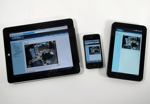
When I first started blogging in 2007, I only needed to worry about what my blog looked like on my computer. There wasn’t that many readers using mobile devices.
How life has changed! Sales of mobile devices continue to see incredible growth and with this there has been a major shift in the consumption habits of our readers.
In fact, nearly 20% of all visits to blogs on Edublogs.org come from mobile or tablet devices! And the number has doubled in the past year!
Now I need to worry what my blog looks like on a computer and mobile devices. And I have this annoying voice in my head going — you can only change the theme if it is responsive….it must be a responsive theme.
PS. The annoying voice is my colleague Ronnie Burt – and he is right 🙁
Responsive themes are designed to display nicely on all devices, including phones, tablets and desktops, whereas non-responsive themes are best viewed on desktops. With a responsive theme you can customize it to your heart’s content knowing that it’ll look good on all devices.
Let’s look at why using a responsive theme is a good idea if you want your blog to be mobile friendly.
What is responsive theme design?

 Photo Credit: exacq via Compfight
A responsive theme is designed to automatically adjust to fit the device you’re reading it on; it adapts the content and layout to suit the resolution of the device.
Non-responsive themes don’t adjust to the resolution of devices.
If you view a non-responsive theme on most modern phones it will automatically zoom out so that your entire blog can be seen. This means your readers need to zoom in to read your content.
Responsive themes and reader experience
Responsive themes are designed to be mobile friendly; they serve web pages at lightening fast speed on any device and in a format that doesn’t require the reader to adjust by zooming in or out to read.
Most major websites now use responsive themes as it means they only need to have one version of their website to work seamlessly across all devices while providing the best reader experience for all visitors.
Check out the following examples of what a non-responsive photo blog theme vs a responsive photo blog theme looks like on an iPhone.
Non-responsive theme
Here’s what my AutoFocus demo blog, which is a non-responsive theme, looks like on my iPhone. You can see the entire blog but need to zoom in to read the content.

Responsive theme
And here’s what my Hatch demo blog, which is a responsive theme, looks like on my iPhone. The text and images (and videos if I had added any) are served at a size that allows the reader to immediately start reading.

Theme layout and responsive themes
A non-responsive theme uses the same layout regardless of the resolution of the device whereas a responsive theme changes layout depending on the screen resolution.
If you are reading this post on a desktop browser just gradually make your browser window smaller. You’ll see the images, videos and content column shrinks, the sidebar disappear and the layout change from two column to a single column of content with the widgets displayed at the bottom of the theme because The Edublogger is using a responsive theme.
Here’s what my personal blog, which uses Yoko – a responsive theme, looks like when viewed on an iPhone, iPad and desktop.

Examples of Responsive themes
You can check out the entire list of Responsive themes on Edublogs here.
See some of them in use on the following blogs:
- Hatch (photo blog theme) – Hatch demo blog
- Hum – Lisa and Tim Photography
- Magazino – Miss Kelly’s Science
- Responsive – Edublogs Help and Support
- Yoko (clean looking white theme ) – Teacher Challenge blog (without image header) Larry Ferlazzo’s Websites of the Day (with custom header image)
There are variations in how blog platforms handle being mobile friendly but if you have an option to use a responsive theme — use the responsive theme!

By the way, Sue, are you going to be attending the Brisbane Edutech conference this year? Be great to meet you in person if you are. You’ve been an inspiration and a great support person for me in my blogging journey.
Dawn
It’s great for apps and viewing on mobile devices, but on a normal computer you see the whole webpage, and you can’t get to zoom in on the single post without the distraction of the rest of the page (as would appear on your mobile device). Is there a way to do this other than using cntrl+ to zoom in each time….? This does seem to be a limitation created by trying to appeal to all readers and their devices…?
Urgh!!! Life used to be so easy. I hadn’t even thought of this and as I am time poor at the moment will revisit this post soon to see what my blog looks like with its theme. Thanks for making me think about this though as mobile learning and researching will take over from fixed access technology.
The learning is never ending. I have to zoom in to view most of my content on the iPh0ne and that means lots of scrolling side to side as it doesn’t simply re-size the columns. Will need to make some changes… and just when I was getting comfortable.
I never knew about this, Sue. I was wondering why I had to constantly zoom in on my devices to read my blog. I made my changes today and what a difference! Thanks!